I always love a good after, the final reveal, the finished product. But I also love to see the work that went into making a space beautiful. I think it helps for future projects as well, because once you've seen the steps that it takes and then see it all come together, you can then look at a "before" space and instantly know how to transform it. So if you're weird like me and are interested in the behind-the-scenes footage, then this is for you.
If you have been reading for a while, you will be well acquainted with how our cottage appeared when we first purchased it three and a half years ago. Teal and pink pretty much sums it up, and not in a good way. You also know that we had some serious space problems. Both bedrooms came with one tiny closet each, which meant that my clothes were stuffed into the closet in the master bedroom and Mr.'s clothes were stuffed into the closet in the guest bedroom (very inconvenient). So we started Project Pepto to create space where we really needed it most. After all there is no such thing as too many closets.
This sketch shows the layout of part of our cottage before renovations began.
This next sketch shows the changes that we have made to the floorplan. To see the dining room renovation go here and for the master bedroom closet renovation go here. For this last phase of the project we closed off the old closet from the master bedroom side and opened up the space on the other side of the guest bedroom (which is now the nursery) to create a larger closet which is way more usable.
This shows what the room looked like when we bought the house. Yep, teal. From top to bottom.

This picture shows the tiny size of the closet before. It was three feet wide.
Here is the guest bedroom after we knocked down the wall between the two closets and created a larger opening for the new closet.
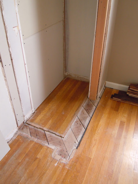
This is what the floors looked like after we took the walls down. We ended up replacing the entire floor so we didn't have to worry about patching the old hardwoods.
The closet after the opening had been patched and primed by Mr. New floors are finished.
Closet shelving going in.
The closet shelving is finished and Mr. works on trim and molding.
Molding is finished and paint goes on.
New lighting is installed.
New doors finally go in. I initially thought that I would put curtains behind the glass doors, and that is my back-up plan for when H turns out to be messy and not keep her closet OCD clean like her mother!
This shows our master bedroom closet doors that we installed when we finished that phase of the project. We decided to match the doors in the nursery to lend some continuity to this crazy cottage. It may seem like an odd choice to put glass doors on a closet, but I love it. It makes the rooms seem larger, more open.
These knobs were original to our 1940s cottage. The backplates on the master closet doors were also original to the cottage and were spray painted to match the hinges. When it came time to finish the nursery, we wanted them to be similar but we didn't have any more backplates that had been salvaged. What to do? Our favorite architectural salvage yard saved the day (I'll have to do a post on that place someday, it's amazing). They had the exact same ones that had been original to our cottage, so those got a coat of spray paint as well and installed on the nursery closet doors along with two more knobs salvaged from the cottage.
So there you have it - a condensed version of the whole renovation process on the nursery. In case you missed the reveal you can find it here.


